a chat with our PLACES poster artist, luke player
Luke Player’s art blends retro design with Australiana.
Tell us about who you are and what you do. I grew up in a little town on the New South Wales South Coast called Stanwell Park, which is on Dharawal Country. In its prime it was a bit of a haven for artists, surfers and weirdos – and the spirit lives on in our amazing creative community. I live here now with my partner Lucia and work as an artist, graphic designer and musician.
How did you get into this line of work? I was always doing art in some form since I was a kid. My youth seemed to be at a really special time for art and design in Australia – there were really strong identities in clothing and design from brands like Mambo and artists like Ken Done. I recall a lot of colourful clothing, bedsheets and tea towels – those visions always stuck with me. Naturally, I ended up at art school, and started playing in bands where the duties of designing artworks and printing merch often fell to me. It snowballed from there! I got lucky and it gradually became a full-time thing.
View this post on Instagram
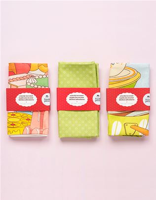
What interests you about retro souvenirs and merch? They always remind me of experiencing the rural weirdness of Australia. I remember going through funny little towns on childhood holidays, eating another ‘world-famous’ pie, and, in my 20s, touring with music where we’d often be stopping over in some unknown place and dipping into the op shop – it gave me a real bug that I just can’t shake. Old souvenirs hold a beautiful imperfection and naivety that’s very familiar to probably everyone in Australia, but also strange and charming – they’re very overlooked pieces of art from unknown artists. They’re a form of outsider art in a way; they’re for the people, not the galleries. In the time of beige-corporate-minimalist design, seeing something like an old bright tea towel hits me like a tonne of bricks.
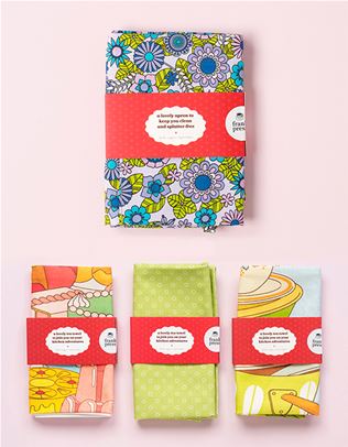
What kind of souvenirs could we find in your personal collection? I try not to seek them out; they gravitate toward me. My only real rule is to stick to the Australian-centric stuff. There’s a pretty good assortment of tea towels, matchbooks, woven patches, postcards, felt pennants, old books, salt and pepper shakers – the list goes on. I often like the ones that are a bit wonky and amateur. I found a great Queensland souvenir glass recently with an inbuilt bell to ring for your next drink. It was just an old stubby glass sawn in half and glued back together upside down! Incredible.
View this post on Instagram
Walk us through the creative process of designing one of your travel posters. Usually I’ll see most of the poster in my head from the get-go, but the hardest part is translating it without getting in the way of that initial idea. I try not to stick to formulas too much; I find the location itself will usually guide me in how to represent it. I’ll often take a bunch of photos and cut them up, taking creative liberties to really nail a composition or colour palette. If I’m envisioning a specific bird, flower, tree or cloud, I’ll seek inspiration in one of my old Australian flora and fauna photo books. I don’t want to get hung up on the retro thing too much, so I surround myself with inspiration from previous decades and it tends to flow naturally in a certain style. In saying that, I have spent a few too many hours staring at and decoding old posters, so it is a bit of an obsession!
When you’re coming up with a new idea, how do you decide whether you turn it into a poster, tea towel, or another kind of merch? I find myself setting little parameters for different items. It’s kind of trivial, but there are certain themes you notice after a while, like: bumper stickers are funny; tea towels are pretty much collages; t-shirts are bold; posters are intricate; so on and so forth. When I have the initial idea, it always feels clear on what it’s supposed to be and there’s a real satisfaction to nailing that.
View this post on Instagram
Have you visited all the locations that are featured in your work? Yes, I have! I try to keep a rule that I have to visit somewhere first before I can use it in an artwork (not including commissioned works from other parts of the world). They’re really the results of passion projects: working with places local to me or locations visited while travelling around. I’m always hoping to capture the feeling of a place and do it justice.
What’s your favourite Australian holiday destination? I’ve got a love that extends across the whole of the South Coast, from Illawarra through to the Victorian border. I grew up camping at Mystery Bay so I’ve got a real soft spot for that area, including Tilba Tilba, Bermagui and surrounds. The places with memories connected to them always remain strong, from writing an album with friends in Warburton to visiting Bellingen as a family most years for the world music festival. Ocean pools are also important to me – I think New South Wales has the highest concentration of them in the world! Most places have something to offer; rural towns are great for their funny little motels and cafés. If it’s got a ‘big thing’, even better. I’m always open to finding a new favourite.
View this post on Instagram
Which design era is your favourite? Every era has its own peaks in different areas: the mid-century had great travel posters, the ’60s had the best record covers, the ’70s had wild surf graphics, the ’80s produced some fine souvenirs and the ’90s had Mambo. Don’t make me choose! To narrow it down, generally the more hands-on the era of design was, the better it looks now.
Where can we see more from you? I’m planning an exhibition of hand-screen-printed travel posters, both old and new, that’ll run from December 11th to 15th at the Clifton School of Arts in New South Wales, and I’m planning a bunch of new designs and souvenirs and tees for the summer! You can find me on Instagram @lukeplayer and at lukeplayer.com.au
This lovely interview comes straight out of PLACES. To nab a copy, head over to the frankie shop or visit one of our lovely stockists. For future issues, subscribe here.
_(11)_(1).png&q=80&h=682&w=863&c=1&s=1)


.jpg&q=80&w=316&c=1&s=1)