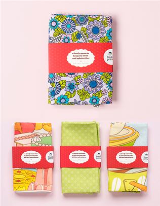
tips and tricks for making bold prints look super-rad
Melbourne interior stylist Heather Nette King on how to be bold.
What is it about bold prints that make us want to do a little jig? For starters, they’re a sure-fire way to add razzle-dazzle to a lacklustre abode. Prints are a heck of a lot more show-stopping than the plain beige styling you’ll get with most rentals and new homes. They also help you put an individual stamp on your interiors. Most people assume it takes confidence to use bold prints, but if you’re keen to spice things up with bright colours and wild patterns, you don’t have to go all out. Melbourne interior stylist Heather Nette King, who works with the folks over at Carpet Court, says you can always start small. Here, she shares tips and tricks for people who want to be bolder but don’t know where to begin.
How much print should you use? A lot depends on your commitment level. If you use lots of prints in your soft furnishings such as cushions, furniture upholstery or window coverings, then stick with plain walls and simple floor coverings. It’s the same in reverse, too – if you cover your walls in a bold wallpaper or painted finish, you can still be very selective about any extra prints that you add to your soft furnishings.
What should we know about scale? Whether they’re large or small in scale, it’s important to remember that prints can be very bold. A floral pattern can be dainty or bold, depending on the colour palette and the amount you use. For example, a small floral will look dainty on a cushion, but if four walls are covered in it, then its strength will be amplified.
What about mixing and matching prints? Mixing spots, stripes, florals, checks, plaids and tribal motifs can look incredible, but there needs to be a common thread. This can be either the colour palette or the scale of the print or theme, such as botanicals. Without something to pull it together, the room may end up looking a little lost.
How do I use bold prints on my floor? A boldly patterned floor can provide an amazing anchor for a room. It can dictate a colour palette or consolidate the style, providing a focal point for the room plan. Floral carpet or floral rugs, such as Carpet Court’s Raffia range, can be very pretty or romantic if they’re traditional in style or even very moody if the colour palette features dark burgundy, deep rose and black. Patterned rugs, such as Carpet Court’s Evoke in Remy Silver, can signal a decorating style – a strong geometric print can reflect a Hollywood regency style room.
Checkerboard rugs are enjoying a big revival now and work well with the Memphis-revival style. Patterned rugs and patterned carpet bring a sense of liveliness to a room, drawing your eye into the centre, so they’re great for communal areas. And finally, a textured carpet can make a bold statement, even if it’s in a single hue, just by virtue of its visual texture – a shaggy, deeply-piled carpet will always get attention.


.jpg&q=80&w=316&c=1&s=1)