throwback thursday - gemma o'brien
Time sure does fly when you're busy writing about all the fab folk out there, and it's been two years (or 14 magazine years) since we first had a chat with designer Gemma O'Brien.
Time sure does fly when you're busy writing about all the fab folk out there, and it's been two years (or 14 magazine years) since we first had a chat with designer Gemma O'Brien. Back in issue 42 Gemma declared her love for all things typographic, explaining everything from how lettering makes your life better to which is the sexiest letter of the alphabet (that's uppercase 'H' and lowercase 'g', she'll have you know).
We figured we were well overdue for a catch-up with the talented type enthusiast, so we got in touch with some questions about her current projects, including one she calls the Spewbag Challenge (it's not as messy as it sounds, swear!)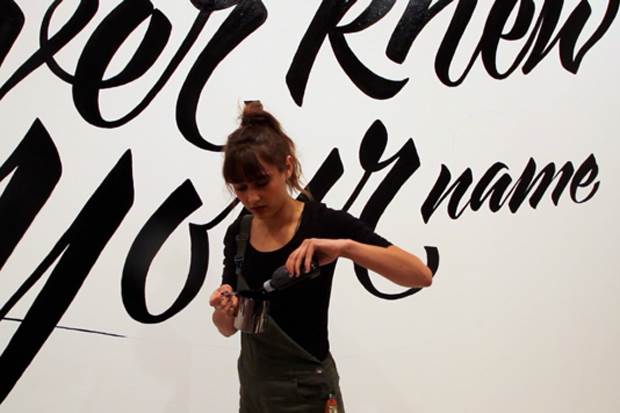
What have you been up to since we interviewed you in frankie magazine? It's been a few years! I had just finished working at Animal Logic and was about to speak at Semi Permanent Sydney. Since then I've worked at Toby & Pete and Fuel VFX, and now I am full-time-freelancing, repped by the Jacky Winter Group. Overall I think I have been shifting away from motion graphics and art direction and focusing predominantly on typography and illustration in the commercial and art context.
For people who missed the Frankie article, tell us a little about who you are and what you do. I am a typographer and illustrator. It all started when I created a blog, For the Love of Type, back in my second year of design school. Over the past five or six years it has transformed into a fully-fledged career. Most of the time I am creating hand-lettering or custom typography for commercial clients, but I also create more conceptual personal work, host workshops across Australia and speak at a handful of design conferences.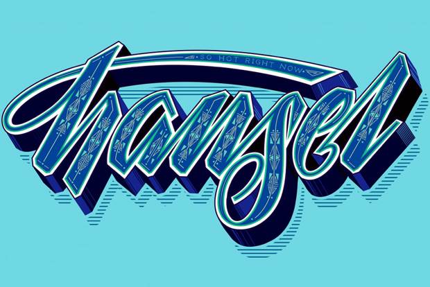
What kind of reaction did you get from the article? Pretty positive! When my mum spotted it in the newsagents she was pretty chuffed too.
What are you currently working on that you want to tell us about? I've just finished my first solo show "Better Left Unsaid" at the Fremantle Arts Centre. It's an immersive lettering installation in a 9x5x5m room. It runs until November 7th. I'm also speaking at Semi Permanent next week, judging the Centenary Typeface Design competition in Canberra over the weekend and working on an exciting project for Clinique that will launch in November.
Why is great typography so important to you? All forms of the written word have the capacity to take on character and convey a particular meaning. Whether it's a slick logo or handwritten scrawl, it says something beyond the words alone. Writing and language are inextricably linked to being human - I'm not interested in great typography from a high design point of view, but rather how it is linked to culture and experience.
What do you think the state of the Australian typography industry is currently like? I think it's flourishing. This isn't only limited to Australia though. In the last five years there's been a real typography boom, both inside and outside the design spheres. Especially the craft side: letterpress printing, hand-rendered lettering, sign painting, calligraphy and brushwork are all back in the spotlight. Designers and advertisers are trying to regain the human side of the printed word after this was momentarily lost in the desktop publishing boom of the '80s and '90s. Fonts are very accessible in the digital culture and overall I think there's a higher level of typographic literacy, which is definitely reflected in the state of the design industry in Australia. We've got places like The Distillery in Sydney that not only offer letterpress printing, but also facilitate workshops and classes. This year saw the debut of Australia's first dedicated typography conference, Typism, and there are a myriad of type-based art shows frequently popping up, plus there are some really talented Aussies creating interesting work (Dave Foster, Luke Lucas, Marty Routledge, Luca Ionescu to name a few.)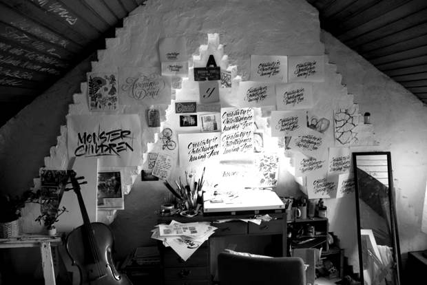
How are you trying to have an effect on that? When I was studying I felt there was a real lack of hands-on, skill-based education available for lettering and typography. For a year or so now I have joined forces with Wayne Thompson at the Australian Type Foundry and we are hosting hand-drawn lettering workshops across Australia. Also, just being annoyingly enthusiastic about all things letter-related helps I think.
Has your style changed or grown over time? If so, how? I think it is shaped by jobs that come my way, especially in a commercial context. Some of the client work I've created over the last couple of years has taken me in directions I may not have otherwise explored in my personal work. I work a lot more with colour I think, gradually moving away from being a black and white purist. I've also starting doing a lot more brushwork, where the feeling of the lettering is captured in the strokes rather than with detailed illustration.
Tell us about the Spewbag Challenge. Well, I thought you'd never ask! It all started with "Fully Sick". I was flying from Sydney to New Zealand in 2012, saw the empty spew bag and couldn't resist the urge to draw on it. Now every time I fly I do the spew bag challenge. The rules are simple. Think of a spew-based pun, draw it on the sick bag over the course of the flight and leave it in the seat where you found it. So far I've done about 15 bags or so... some of my faves are Queasy Lover, Land of the Rising Lunch, Uptown Hurl and Bile High Club. At the end of the day it's just a gag to pass the time while I fly.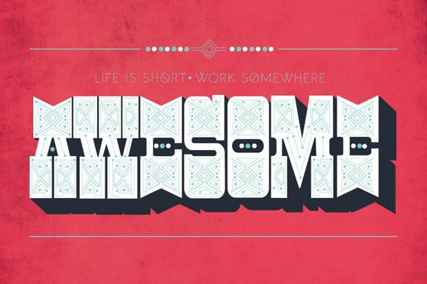
What has been your career highlight to date? Strawberry and cream scented typography for the Woolworth's Christmas campaign and having my Taronga Zoo lettering appear on a crate that transported Kitoto the giraffe 400km down the highway!
Where is the best place to get more information?
Instagram: @mrseaves101
Twitter: @mrseaves
Agency Rep: Jacky Winter

_(11)_(1).png&q=80&h=682&w=863&c=1&s=1)


.jpg&q=80&w=316&c=1&s=1)
.jpg&q=80&w=316&c=1&s=1)