frankie poster artist interview: carla hackett
We've had such a lovely reaction to the special alphabet poster in our 60th issue that we thought we'd give you a looksee behind-the-scenes.
As a group full of passionate, pun-loving word nerds, it goes without saying that the frankie team have a bit of a soft spot for the ABCs. And apparently we're not alone. We've had such a lovely reaction to the alphabet poster in our special 60th issue that we thought we'd give you a looksee behind-the-scenes. The beautiful script was whipped up for us by hand letterer Carla Hackett, who told us a little about what goes into designing a new set of letters, from A to Z.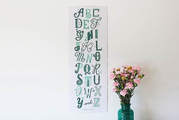
What was the creative brief for the issue 60 poster? This was pretty much a dream brief and I could hang up my pens and die a happy letterer. It was really to just go nuts with lettering and create an alphabet in any style I like! The only constraint was to work with the colour palette of the reverse side's lovely illustration.
How long did it take to think of your concept? Once I knew I had to illustrate 26 individual letters, I decided to make them all very individual but still feel part of a family. I think it took about a day to do rough concept sketches of all 26. I originally thought I might like the letters to all fit together like a jigsaw puzzle of different sizes, but then I realised time was running out and working on the letters individually and keeping them a similar size would be easier.
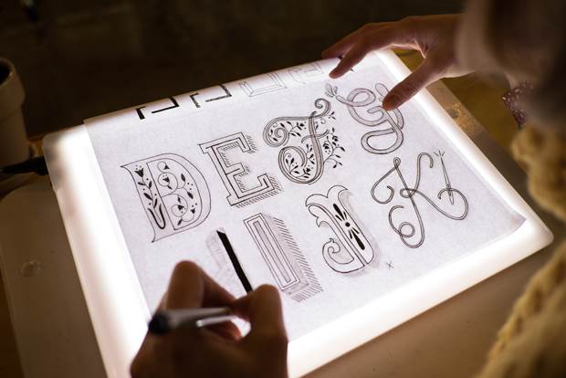
Take us through the process from brainstorming to sketching, and then the final designs. I went through some of my reference books, and my studio buddy had a gem titled Type. A Visual History of Typefaces & Graphic Styles. Just looking at all that lettering got me so excited with ideas that the possibilities felt endless! Once the rough sketches were given the okay, I traced over them in pencil to make super tight drawings where I was happy with the details. Then I traced over them again (thank you lightbox, my friend!) with my favourite Uniball black pen, ready to scan. Once in Photoshop I do a little retouching and up the contrast, then I vectorise the letters in Illustrator. It was then time to compose the alphabet and start playing around with colours! I was having dreams about letters every night.
Which is your favourite letter in the alphabet you created? That's a hard one! When you start looking at them individually there are things I like about all of them, but I'm quite fond of the 'F', with its nice contrast and flower details.
Was there one letter that was particularly difficult to work with? I always find 'S' the hardest to draw. But when I had the idea to turn it into a cat, and everything was A-OK, because cats.
What was your favourite part of the process? Once I had made all the hard decisions about the style of the letters and the final pencil sketches were done, I could just sit and trace the letters for a few hours without too much thinking. Lucky my studio buddy Sass put on her '70s disco playlist for me, as I was alone in the studio on a Friday night.
How do you envisage the poster being used? I think it would look really cute in the bedroom or kitchen! A lot of my friends with babies said they will put it in their kids' rooms! My friend has it hanging on a green door in her studio and you can't get much more matchy-matchy than that.
What do you love about what you do? I love that I get to draw and be able to work in a shared studio with really lovely supportive peeps. I love seeing my hand in a final piece of lettering. I love that I get to nerd out about typography!
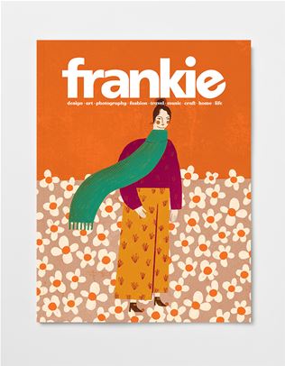
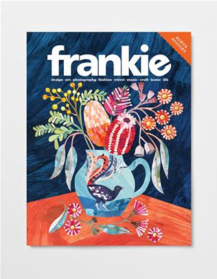
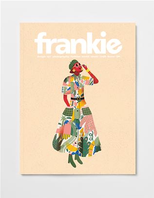
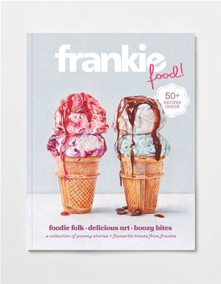
To nab a copy of issue 60 for yourself (including Carla's top-notch poster!), head here. 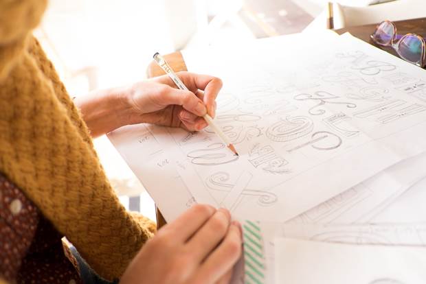
_(11)_(1).png&q=80&h=682&w=863&c=1&s=1)

.png&q=80&h=682&w=863&c=1&s=1)


.jpg&q=80&w=316&c=1&s=1)
.jpg&q=80&w=316&c=1&s=1)